
Eye of the beer-holder
The silly, striking and sublime imagery of Tulsa’s craft brewing scene
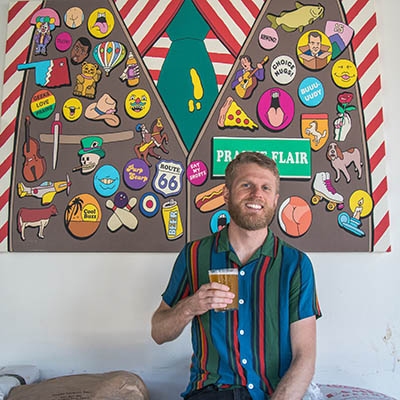
Colin healey, co-founder and art director for Prairie Artisan Ales
Greg Bollinger
Beer labels say a lot. They communicate a brewery’s level of craftsmanship, taste and dedication—a message of no small importance to discerning hop heads. The word taste refers to the domain of the tongue, but any chef worth their salt knows it’s our eyes that set the expectation. Whether crafting a painting or a beer or a wicker basket, the level of skill and vision demonstrated in the work sets the proverbial wolves apart from the sheep.
Prairie Artisan Ales started in 2012 and quickly became known for their world-class brews, and the out-of-this-world artwork wrapped around its coveted bottles. Before Prairie, Okie-made beer labels with this level of aesthetic care were nowhere to be found. Suddenly, Oklahoma’s beer looked as dope as it tasted. The unprecedented quality of artist Colin Healey’s design—as well as the merit of the brews within—set a new standard for Oklahoma.
“It happened organically and in front of a national audience,” Healey says. “I made lots of mistakes.”
If Healey was making mistakes, they didn’t register to the legions of dedicated Prairie fans in Tulsa and around the world who quickly established the brewery as one of the most beloved and buzzed-about craft beer operations in the United States and beyond.
“Both the beer and art of Prairie seem to be able to take any shape they wish. This is our strength, as it gives us many different angles to play from,” Healey says. “We’re kind of like peanut butter and jelly; often complimenting each other in opposite ways. My art switches back and forth from an abstract to harshly cartoony aesthetic. In some instances, a complex, dry-hopped sour ale is contrasted by a playful, colorful label. And in other cases, a more serious, abstract label is paired with a beer made with ingredients like Girl Scout cookies.”
Compare this approach to the artwork emblazoned on, say, a can of Bud Light, whose aesthetic feels more akin to a Gillette Mach 3 razor package: banal, overcompensating, and randomly, awkwardly aggressive.
Oklahoma as a whole appears like a Bud Light can to many Americans. But our local craft brewers and artists are offering the world an image that's decidedly weirder, more authentic, and more beautiful.
The team at Heirloom Rustic Ales cares about beauty, and whole lot of other important things too. Things like literature, experimental music, storytelling, wildlife, the mysteries of existence and providing women a place where they can go hang out, have a beer and not feel like an outsider.
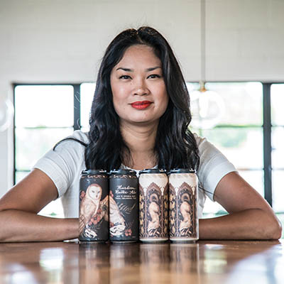
“We’ve traveled to breweries all over, and one thing we noticed about the typical brewery is it’s very manly,” says Melissa French, co-owner and interior designer of the Heirloom taproom on Admiral Boulevard. “It’s very stereotypical that men like beer and women like to drink wine, but that’s not true. There’s actually a large population of women that like to drink beer.”
French designed the space to appeal directly to bring an energy with less machismo than the average taproom, using light, wood, plants and clean lines to create an aesthetic environment more welcoming to everyone.
French owns 50 percent of the brewery. Her husband Zach and brewer Jake Miller own the other half. Together, the three partners don’t just tread the road less traveled through the brewing industry; they take the ancient-druid-forest-trail-marked-by-eagle-feather-and-bone less traveled.
“We wanted to be different,” Miller explains. When Heirloom names a beer, they try to avoid obtuse comments about the material properties of the beer. If anything, they point towards the spiritual space typical label art points away from. The beer, the location, the brewers, and thoughts swimming in their heads, are characters in this broader story. Heirloom is an unconventional narrator, who understands the story is unconquerable. Miller and the rest of the Heirloom crew want you to drink the story.
Heirloom’s “Chapel Visitor,” an American wild ale, is so-named to evoke the image of an ancient place of worship hidden deep within the forest. Brooklyn-based artist Jessica Roux, who has contributed illustrations to J.K. Rowling’s Pottermore website, designed the label. She represents the beer visually by a weathered skull, crowned by dried reeds sharpened at the tip atop a bed of small, dead leaves that suggest thinning curly hair. A tulip—a historical reference to the “bleeding” tulips of the Dutch flower trade—dangles near the mouth of the skull, which is missing its lower jawbone.
Roux explains that this type of tulip looked as if it was bleeding, due to a viral infection. “And while it was really beautiful, the more they bred them the weaker the flower got. Eventually they couldn’t make flowers like that anymore.”
The tragic ephemerality of the flower reverberates with the dark magnetism of an arcane holy site. The two distant modalities wallow in the same moonlit pool. Somewhere nearby, the spirit of the beer might reveal itself. To glide among the visual symbols, allowing their ghosts to map out a portion of the beer’s flavor in the mind’s eye, is a classically Heirloom Rustic Ales moment.
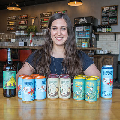
“A stranger came up to me at a beer festival and lifted up his pant leg, and he had this lure tattooed on him!” Lisa McIlroy says. The image comes from the design of Cabin Boys’ “Cast-a-Line Kolsch,” one of Tulsa’s most crushable session craft beers. It’s pretty clear by the tone of her voice that she’s still a little blown away by the fact that someone tattooed an element from her brewery’s artwork on their body. After all, Cabin Boys is barely a year-and-a-half old.
 The fishing lure jumps out of the pale, matte blue background of the “Cast-a-Line Kolsch” can. Bold feathery red and yellow flashes strike like a fighting rooster. The lure is brilliant, both in color and motion. A fisherman, who we see from directly above, is wading in the steady river.
“It’s an I-wanna-be-on-the-lake beer,” McIlroy says. Her husband and head brewer Austin McIlroy refers to the beer’s flavor as “biscuity.” Crisp and light, ringing with a subtle richness, this is not a beer to get hung up on, but rather, it’s a beer to chill with.
The artwork on the Bearded Theologian Belgian Quad can depicts a rosy-cheeked gentleman smoking a pipe, his brow furrowed in studious contemplation, pouring over a pale blue book held up by locks of his own sprawling beard. Suspended in the pale, earth-tone background, a rising swirl of tobacco smoke. Inside the can, is a caramel-colored, high gravity medley of crème brûlée, coconut and cashew notes. Like the figure on the can, the beer is unadorned on the palate, steadfast and faithfully adherent to its Trappist forbearers.
The founders of Cabin Boys are earnest, straightforward and cheerful. Their social media feed is bastion of wholesomeness in an otherwise image-obsessed world. Silly costumes, corny jokes, the brewers rip on each other good-naturedly here, goofing on yoga poses there. There is kindness in their smiles, they promote their wares unpretentiously. How’s that for trippy?
If you want to develop a better understanding of what minimalism is, consider the can designs of Tulsa’s current innovative forebear, American Solera. Though not technically Minimalist in a strict sense, the designs perform similar tricks.
“I don’t even know what this style is,” Cappa says. “I try to do patterns mostly.”
Whatever the style, there is no question that there is something to behold in Joe Cappa’s designs. Powerful baths of precisely-tuned color. Satisfying patterns. Cohesion. Things click. A Solera tallboy from the fridge of their SoBo tap house is money well spent. American Solera’s double IPAs crush. Visually, the cans tasteful, funny, and bold, but never dumb, obvious, or gauche.
Solera cans are simple, but not simplistic. They’re fancy, but not fancy-schmancy.
“Mainly Chase [Healey] comes up with a name, then comes to me asking for a design,” Cappa explains. “Sometimes you kinda have to shut off your brain and think of the simplest, most immediate thing that comes to mind.”
I asked him what he was thinking when he made the design for Peacebone, a delicious strawberry and vanilla DIPA with a cheerful, muted pink can. The name Chase picked is a shout-out. It’s the nickname for one of the Solera brewers.
“I was thinking, ‘Peacebone: Peace, bone. Peace. Rainbows …” Cappa begins. After a few moments of searching for the words to define his undefinable process, he gives up and laughs.


.jpg)
.jpg)